

NCS Colours in Interior Design: Choosing a Palette for Your Light

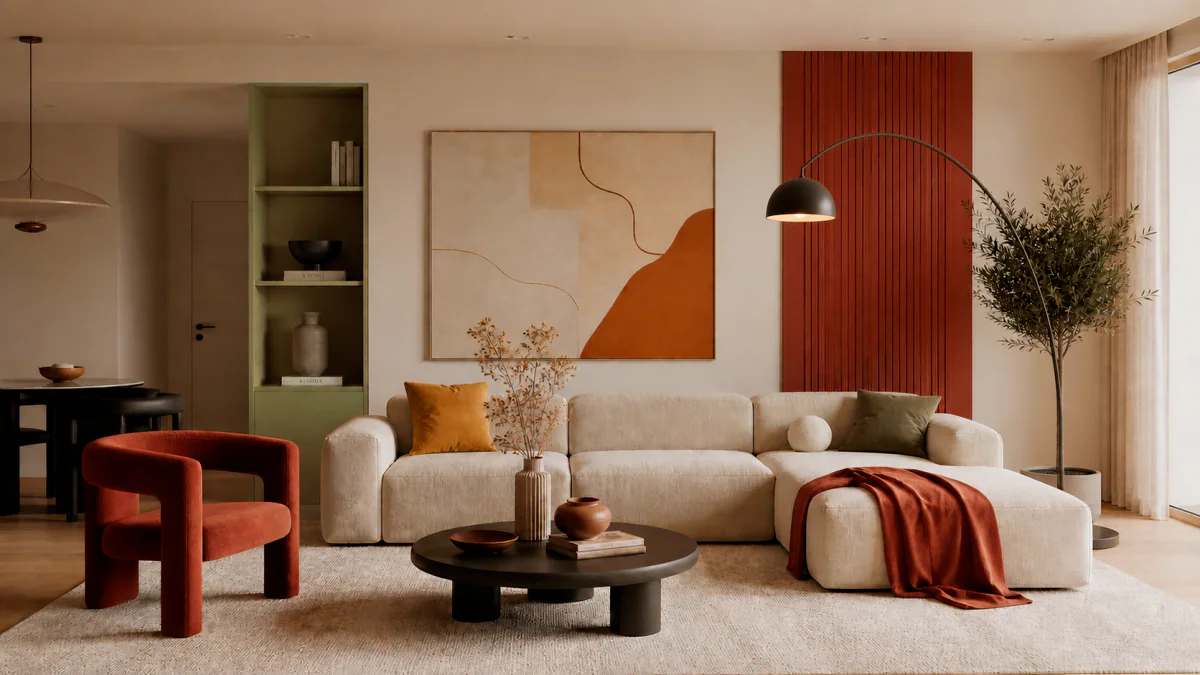
The same wall colour can look different in a shop, on a screen and in your room. Compare a palette with daylight, light fittings and neighbouring materials before deciding. Window orientation is a starting point, not a prediction of the final result.
Within an interior design project in Portugal, I consider colour alongside layout, furniture and lighting. NCS, the Natural Colour System, provides a useful way to discuss and record shades.
What does NCS describe?
NCS describes perceived colour through hue, blackness and chromaticness. It is a shared language for comparing colours, not a pigment-mixing recipe. See the official NCS Colour explanation for these characteristics.
A code records a selection for discussion with a supplier. It does not predict exactly how every finish will appear in a particular room. Use a physical sample and a paint test of the selected product for the final decision.
North-facing rooms: compare warm and neutral shades
If a room feels cool and receives little direct sun, test warm neutrals alongside quieter greys. Cream, sand or muted olive may be options to assess, rather than a compulsory palette for every north-facing space.
Compare samples near the window and further into the room. Nearby buildings, greenery and shading also affect reflected light. Choosing a warm colour alone will not resolve insufficient lighting.
South-facing rooms: test the palette in bright light
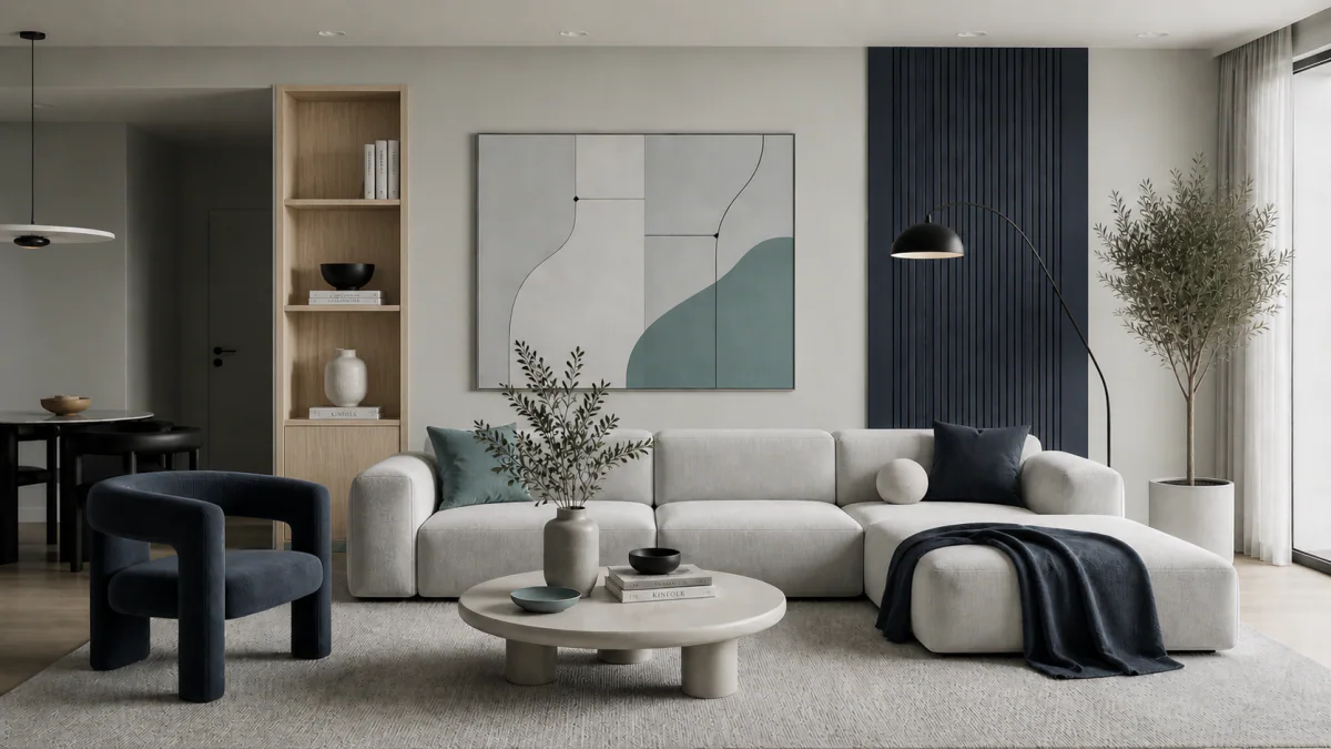
In a well-lit room, compare a light neutral base with cooler or more muted alternatives. Blue, green and graphite may provide the contrast you want; their place in the room depends on the whole composition and your preferences.
Account for curtains, shading, room depth and season. A south-facing window does not mean identical light throughout the day. A colour that feels visually cool is not a solution to a room’s actual temperature.
East and west: review the room at different times
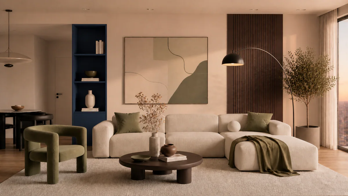
For east-facing rooms, compare the palette in the morning with its appearance under evening lighting. For west-facing rooms, view samples before and during sunset. Pay attention to the hours when you normally use the space.
A single appealing moment is not enough to select a shade. Warm beige, a green accent or a dark detail can look different beside existing floors and furniture. Put the samples together as one group.
Windowless rooms: settle the lighting first
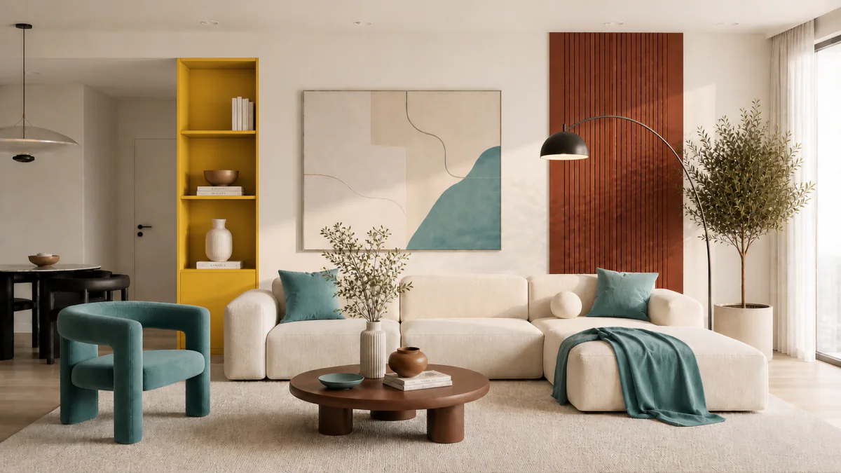
In a bathroom, dressing room or other space without daylight, assess colour under the light sources you intend to use. Both a light palette and a more intimate dark scheme are possibilities. The choice depends on the room’s function and the atmosphere you want.
First plan light for mirrors, storage or work, then review the colours. Pale paint does not replace suitable lighting. In wet areas, separately check the chosen coating’s suitability and the condition of the surface.
How to check a colour before buying paint
- Choose a few physical samples rather than relying on screen images.
- Confirm the product, sheen and surface preparation with the supplier.
- Make paint tests and compare them with the room’s actual materials.
- Review them in the morning, during the day and with evening lights on.
- Record the approved code, manufacturer and coating name.
NCS Colour also advises assessing samples under lighting similar to the intended room. See its Interior & Exterior 84 guidance.
Connect the palette to the whole interior
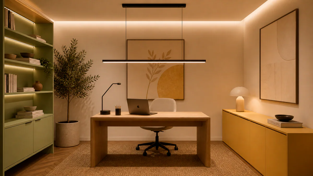
When furnishing an apartment in Portugal, compare paint with upholstery, curtains, cabinet finishes and flooring. For a base you can update over time, explore the capsule interior approach as well.
An interior design consultation can help with a particular room. Send photographs, a plan and information about the windows to discuss the palette and the checks needed at your property in Portugal.